Inside ReciPal's Redesign
A Fresh and Functional Transformation
You may have noticed a new look inside of ReciPal. This redesign marks a huge step forward for the ReciPal platform. It’s the first major design change inside the platform since it launched more than 10 years ago. A lot has changed since then and we were excited to leverage the technological developments alongside tons of user feedback to create a cleaner, more intuitive, and more responsive experience.

We completely understand that any change takes some time to adjust to. And if you’ve been using ReciPal for years the new look may seem foreign…like the first time you saw your uncle after he shaved his signature mustache. That said, we’ve maintained all the same functionality you’ve come to love and now packaged it in a way that’s more flexible and powerful. With more consistent text hierarchies, increased white space, and unified conventions, we worked to make the pages easier to read and navigate. If anything’s confusing, we also made new video tutorials to help walk you through each of the redesigned pages. Since launching, we’ve been working with users to fine-tune these features and have been happy to hear many great reviews.
Prioritizing Responsiveness
The redesign isn’t just about aesthetics either. While we’re excited about the make over, we’re even more excited about what it allows us to do. First and foremost, this redesign was based around creating an adaptable, mobile-friendly experience. Previously, ReciPal worked great on a laptop or desktop, but wasn’t as easy to use on a phone or tablet. As a natively cloud based software, we value ease of use and accessibility. Now, within the recipe creation process all the screens are responsive to create an effortless user experience regardless of what device you’re on.

Enhanced Functionality
We also looked at how users were working within our platform and made intentional design choices to help streamline their workflows. One example of this is the floating previews for the nutrition fact panel and ingredient list. Previously as users added ingredients to their recipe they would need to scroll up and down to see how those inputs affected their nutrition fact panel or ingredient list. Now those previews stick with you as you scroll on the page so that you can always see how your edits affect your end product.

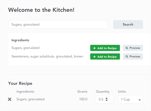
The responsive displays also allowed us to build out more powerful functionality. Previously in the nutrition breakdown you couldn’t see the breakout of ingredients within subrecipes. Now subrecipes are expandable to show their individual ingredients’ nutritional values. Further, we’ve made adding ingredients to recipes even faster and easier. You can now add ingredients with just one click and the search bar will always be located below the last ingredient you’ve added, streamlining the recipe creation process. And, all of your recipes are now easier to manage with more robust filtering and tagging capabilities. Plus actions that could only be taken from the recipe dashboard, like copying, scaling, or creating a subrecipe, can now be done while within a recipe.
If you’ve been using ReciPal for a while then you probably know that we’re very receptive to feedback and always looking to learn from our customers. So if you’re missing something, can’t figure out how a certain functionality works, or just have an idea for how we can continue to improve the platform, please let us know.


