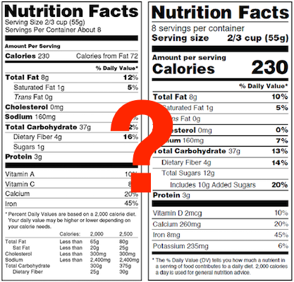
Official Nutrition Facts Font
This question comes up a lot and for good reason. The nutrition facts font we often see is very recognizable, which makes the label itself recognizable and also easy for consumers to read.
Since we make nutrition label software we are always noticing nutrition fact labels, whether it's online or in real life, and too often the label just doesn't look right because of the font. Unfortunately something as small as a font can make a product look less professional and more difficult to read. In this post we'll go over what the FDA says about fonts and what we use on our labels.
The FDA's stance is actually very simple and non-restrictive:
"The nutrition label shall utilize a single easy-to-read type style."
As the FDA rules point out above, there is no font style mentioned at all. So how did so many labels end up with the same font? Well, in many of the examples that the FDA provides, they happen to use Helvetica (see a series of examples).
So, the bottom line is that your nutrition fact label font should be:
- Easy to read
- Consistent (single font throughout your nutrition label)
- And lastly, use bold/italics for certain nutrients
At ReciPal, we use Helvetica and Arial, depending on what font is available on your computer. Helvetica and Arial (font geeks may scream at me for this), while not identical, are very similar and both provide the look and feel for a proper nutrition facts label.
In the end, any font deemed "easy to read" is OK to use on your nutrition facts label. The FDA uses Helvetica in their examples and (most likely) because of that fact most labels use Helvetica. As a result, this has become an industry standard, making labels that use other fonts look a bit unprofessional despite being completely acceptable as far as the FDA is concerned. For customers reading labels, the Helvetica font is easier to recognize and makes the label and layout feel familiar and easy to follow.


